A Design Pyramid for WebApp
- Introduction
- The creation of an effective design will typically require a diverse set of skills.
- Sometimes, for small projects, a single developer may need to be multi-skilled.
- For larger projects, it may be advisable and/or feasible to draw on the expertise of specialists:
- Web engineers,
- Graphic designers,
- Content developers,
- Programmers,
- Database specialists,
- Information architects,
- Network engineers,
- Security experts,
- Testers.
- In Design pyramid for WebApps, each level of the pyramid represents a design action…
Interface Design
- Where am I? The interface should
- provide an indication of the WebApp that has been accessed
- Inform the user of location in the content hierarchy
- What can I do now? The interface should always help the user understand his current options
- what functions are available?
- what links are live?
- what content is relevant?
- Where have I been, where am I going? The interface must facilitate navigation.
- Provide a “map” (implemented in a way that is easy to understand) of where the user has been and what paths may be taken to move elsewhere within the WebApp.
Aesthetic Design
- Aesthetic design, also called graphic design.
- Layout Issues :
- Don’t be afraid of white space.
- Emphasize content.
- Organize layout elements from top-left to bottom right.
- Group navigation, content, and function geographically within the page.
- Don’t extend your real estate with the scrolling bar.
- Consider resolution and browser window size when designing layout.
Content Design
- Develops a design representation for content objects
- For WebApps, a content object is more closely aligned with a data object for conventional software.
- Represents the mechanisms required to instantiate their relationships to one another.
- Analogous to the relationship between analysis classes and design components.
- A content object has attributes that include content-specific information
- Implementation-specific attributes that are specified as part of design
Architecture Design
- Content architecture focuses on the manner in which content objects (or composite objects such as Web pages) are structured for presentation and navigation.
- The term information architecture is also used to predict structures that lead to better organization, labeling, navigation, and searching of content objects.
- WebApp architecture addresses the manner in which the application is structured to manage user interaction, handle internal processing tasks, effect navigation, and present content.
- Architecture design is conducted in parallel with interface design, aesthetic design and content design.
- Content architecture :
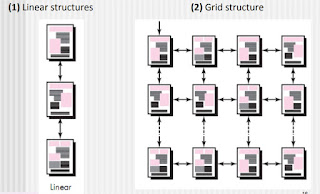
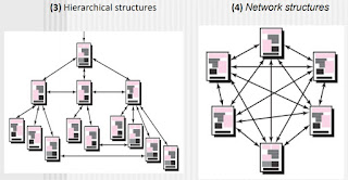
- Four different content structures :
- (1) Linear structures
- (2) Grid structure
- (3) Hierarchical structures
- (4) Networked or “pure web” structure


- WebApp architecture
- WebApp architecture describes an infrastructure that enables a Web-based system or application to achieve its business objectives.
- The Model-View-Controller (MVC) architecture is one of a number of suggested WebApp infrastructure models that decouple the user interface from the WebApp functionality and informational content.
Model-View-Controller (MVC) architecture
- Model :
- The model (sometimes referred to as the “model object”) contains all application-specific content and processing logic, including all content objects, access to external data/information sources, and all processing functionality that is application specific.
- View :
- The view contains all interface specific functions and enables the presentation of content and processing logic, including all content objects, access to external data/information sources, and all processing functionality required by the end user.
- Controller :
- The controller manages access to the model and the view and coordinates the flow of data between them.
Navigation Design
- Begins with a consideration of the user hierarchy and related use cases.
- Each actor may use the WebApp somewhat differently and therefore have different navigation requirements
- As each user interacts with the WebApp, it encounters a series of navigation semantic units (NSUs)
- NSU—“a set of information and related navigation structures that collaborate in the fulfillment of a subset of related user requirements”
Navigation Semantic Units
- Navigation semantic unit
- Ways of navigation (WoN)—represents the best navigation way or path for users with certain profiles to achieve their desired goal or sub-goal. Composed of …
- Navigation nodes (NN) connected by Navigation links
Navigation Syntax
- Individual navigation link—text-based links, icons, buttons and switches, and graphical metaphors..
- Horizontal navigation bar—lists major content or functional categories in a bar containing appropriate links.
- Vertical navigation column
- lists major content or functional categories
- lists virtually all major content objects within the WebApp.
- Sitemaps—provide an all-inclusive tab of contents for navigation to all content objects and functionality contained within the WebApp.
Component-Level Design
- WebApp components implement the following functionality
- Perform localized processing to generate content and navigation capability in a dynamic fashion
- Provide computation or data processing capability that are appropriate for the WebApp’s business domain
- Provide sophisticated database query and access
- Data interfaces with external corporate systems.
WebApp Design Goals
- Introduction :
- Jean Kaiser suggests a set of design goals that are applicable to virtually every WebApp regardless of application domain, size, or complexity.
- The following are the set of design goals to apply webApp
- Simplicity
- Consistency
- Identity
- Robustness
- Navigability
- Visual Appeal
- Compatibility
- Simplicity
- Content should be informative but to the point and should use a delivery mode (e.g., text, graphics, video, audio) that is appropriate to the information that is being delivered.
- Architecture should achieve WebApp objectives in the simplest possible manner.
- Navigation should be straightforward and navigation mechanisms should be naturally obvious to the end user.
- Functions should be easy to use and easier to understand.
- Consistency
- This design goal applies to virtually every element of the design model.
- Content should be constructed consistently
- e.g., text formatting and font styles should be the same across all text documents;
- Graphic art should have a consistent look, color scheme, and style)
- Identity
- Establish an “identity” that is appropriate for the business purpose.
- Robustness (Strength)
- The user expects robust content and functions that are relevant to the user’s needs.
- Navigability
- Navigation should be simple and consistent.
- It should also be designed in a manner that is predictable.
- The user should understand how to move about the WebApp without having to search for navigation links or instructions.
- Visual appeal
- The look and feel of content, interface layout, color coordination, the balance of text, graphics and other media, navigation mechanisms must appeal to end-users
- Compatibility
- WebApp will be used in a variety of environments (e.g., different hardware, Internet connection types, operating systems, browsers)
- It must be designed to be compatible with each.
WebApp Design Quality
- Introduction:
- There are essentially two basic approaches to design:
- The artistic ideal of expressing yourself
- The engineering ideal of solving a problem for a customer.
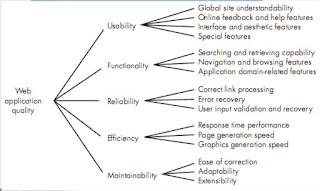
- Design is the engineering activity that leads to a high-quality
product. This leads us to a recurring question that is encountered
in all engineering disciplines: What is quality?

- Some other quality attributes
- Security
- WebApps have become heavily integrated with critical corporate
and government databases. E-commerce applications extract and
then store sensitive customer information.
- Rebuff (Reject) external attacks
- Exclude unauthorized access
- Ensure the privacy of users/customers
- Availability
- The measure of the percentage of time that a WebApp is available
for use.
- Scalability
- Can the WebApp and the systems with which it is interfaced
handle significant variation in user or transaction volume… If
numbers of users are extend…
- Time to Market
- although time-to-market is not a true quality attribute in the
technical sense, it is a measure of quality from a business point of
view.
WebApp Design Patterns
- There are two dimensions in WebApp Design Patterns:
- The design focus of the pattern and its level of granularity.
- Design focus identifies which aspect of the design model is relevant (e.g., information architecture, navigation, interaction).
- Granularity identifies the level of abstraction that is being considered (e.g., does the pattern apply to the entire WebApp, to a single Web page, to a subsystem, or an individual WebApp component?).
- Design Focus
- WebApp patterns can be categorized using the following levels of design focus
- Information architecture patterns relate to the overall structure of the information space, and the ways in which users will interact with the information.
- Navigation patterns define navigation link structures, such as hierarchies, rings, tours, and so on.
- Interaction patterns contribute to the design of the user interface.
- Presentation patterns assist in the presentation of content as it is presented to the user via the interface.
- Functional patterns define the workflows, behaviors, processing, communication, and other algorithmic elements within a WebApp.
- Design Granularity: When a problem involves “big picture” issues, you should attempt to develop solutions (and use relevant patterns) that focus on the big picture.
- In terms of the level of granularity, patterns can be described at the following levels.
- Architectural patterns. This level of abstraction will typically relate to patterns that define the overall structure of the WebApp, indicate the relationships among different components.
- Design patterns. These address a specific element of the design such as an aggregation of components to solve some design problem, relationships among elements on a page, or the mechanisms for effecting component-to-component communication.
- Component patterns. This level of abstraction relates to individual small-scale elements of a WebApp.
User interface Design Patterns
- Hundreds of user interface (UI) patterns have been proposed in recent years.
- Most fall within one of the following 10 categories of patterns :
- (1) Pattern: TopLevelNavigation
- Brief Description: Used when a site or application implements a number of major functions. Provides a top-level menu, often coupled with a logo or identifying graphic, that enables direct navigation to any of the system’s major functions.
- (2) Pattern: CardStack
- Brief Description: Used when a number of specific subfunctions or content categories related to a feature or function must be selected in random order. [e.g. DropDownList]
- (3) Pattern: Fill-in-the-Blanks
- Brief description: Allow alphanumeric data to be entered in a “text box.”
- (4) Pattern: SortableTable
- Brief description: Display a long list of records that can be sorted by electing a toggle mechanism for any column label.
- (5) Pattern: BreadCrumbs
- Brief description: Provides a full navigation path when the user is working with a complex hierarchy of pages or display screens.
- (6) Pattern: EditInPlace
- Brief description: Provide simple text editing capability for certain types of content in the location that it is displayed.
- (7) Pattern: SimpleSearch
- Brief description: Provides the ability to search a website or persistent data source for a simple data item described by an alphanumeric string.
- (8) Pattern: Wizard
- Brief description: Takes the user through a complex task one step at a time, providing guidance for the completion of the task through a series of simple window displays.
- (9) Pattern: ShoppingCart
- Brief description: Provides a list of items selected for purchase.
- (10) Pattern: ProgressIndicator
- Brief description: Provides an indication of progress when an operation takes longer than n seconds.
Component Level Design Patterns
- Component-level design patterns provide you with proven solutions that address one or more subproblems extracted from the requirements model.
- In many cases, design patterns of this type focus on some functional element of a system.
- For example: Searching is a very common problem, it should come as no surprise that there are many search-related patterns like…
- AdvancedSearch
- HelpWizard
- SearchArea
- SearchTips
- SearchResults
- SearchBox

